
Search engines continue to stress the importance of great user experience, intuitive user interfaces, and fast page load time. Google refers to these metrics as Core Web Vitals, and among them is one called Cumulative Layout Shift (CLS). So, what is CLS, and why does it matter to users or search engines? CLS is a performance metric that measures how stable your web page is during loading. When elements shift around as the page loads, it creates a frustrating experience for visitors. Check out this example from the New York Times:
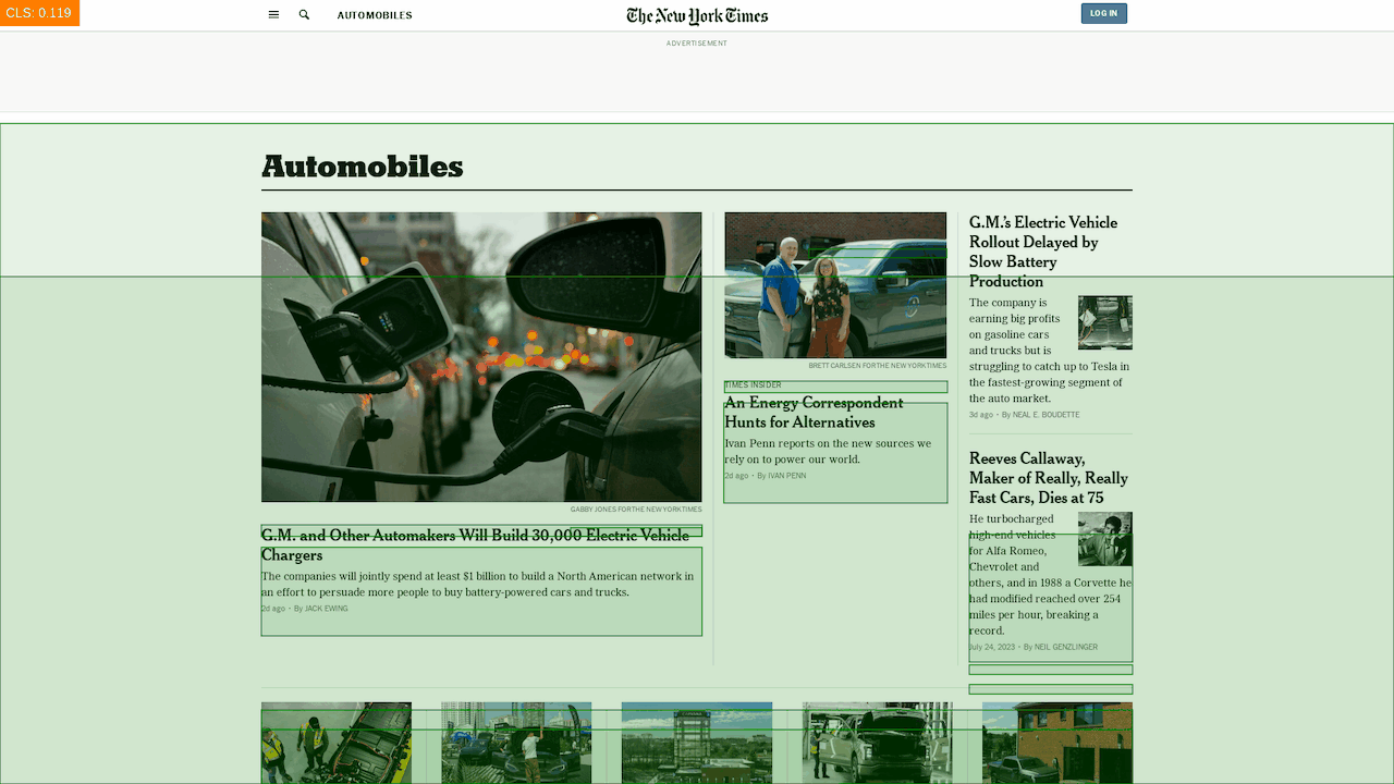
The green boxes show how content moves on the site after the initial pageload. You can imagine that reading a news website while content moves around the page would be quite frustrating, and that’s exactly why web developers should seek to minimize CLS.
But, CLS is more than just a user experience issue. Because search engines prefer sites with a great user experience, a good CLS score can actually boost your website's visibility in search results. Having a perfect CLS won’t guarantee you’ll hit the first page of Google results, but all other things equal, it might ensure you outrank competitors with poor CLS.
In this guide, I’ll share actionable insights for identifying, debugging, and improving CLS issues on your website. By implementing these best practices, you'll ensure a seamless user experience, improve your website's overall performance, and (hopefully) rank higher in search engines than before. Let’s dig in.
Understanding CLS
As mentioned above, CLS measures the visual stability of a web page. It gauges how much the page shifts as content loads. CLS tends to frustrate users because as they navigate your website, elements on screen are moving, leading to misclicks and a cumbersome reading experience.
CLS is calculated by multiplying the percentage of the viewable screen affected by the shift with the distance the elements moved. This shift is often caused by images and other media elements loading asynchronously without pre-defined dimensions in the HTML or CSS documents.
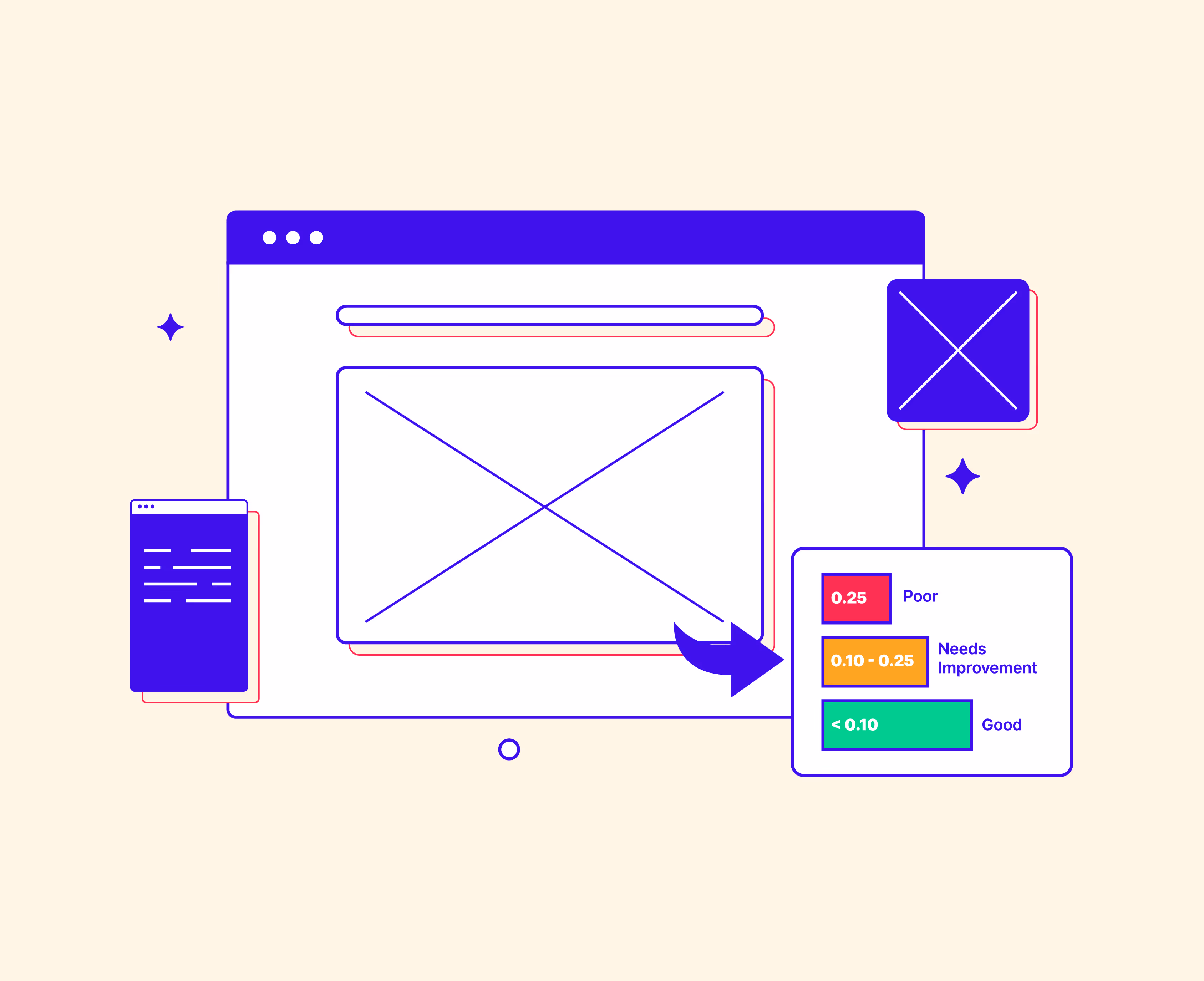
Google officially defines CLS scores within the following ranges:
- Good: Less than 0.10
- Needs Improvement: Between 0.10 and 0.25
- Poor: Above 0.25
In more technical terms, CLS happens because browsers retrieve and render the various files that make up a webpage at different times in the loading process. Typically, the browser gets HTML from which it constructs a Document Object Model (DOM) tree. The DOM is combined with styles defined in CSS (Cascading Style Sheets), and from the combined structure and style, the browser will start to render elements on the screen.
But what happens if a large visual element, like an image, takes a long time to load?
The browser can’t show it or know the image’s dimensions until it’s downloaded, so when the image finally arrives, it could push other content on the page around in order to fit in its place in the DOM.
This problem can be solved by defining the size of every element on screen in the HTML or CSS, ensuring that the browser reserves the correct amount of visual space on screen, but this is often easier said than done. For example, what about text? Unless you know exactly how tall every line is and how many lines every element on the page has, it can be really hard to reserve space for large sections of text. We’ll explore some solutions later, but at this point, it’s important to understand why it’s not always trivial to eliminate CLS issues.
Measuring CLS
Before we dive deeper into some of the specific issues that contribute to poor CLS scores, let’s look at the tools you can use to identify your CLS score and the parts of your site that might be hurting it.
Web Page Testing Tools
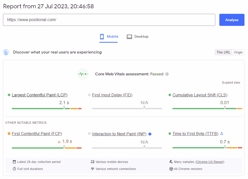
There are various (mostly browser-based) tools available that provide LCP measurement as part of their performance analysis metrics. Google Search Console, Google PageSpeed Insights and the corresponding API, WebPageTest, and GTmetrix all provide LCP metrics in addition to other performance-related data. Simply enter your website's URL into these tools, and they will generate a detailed performance report.
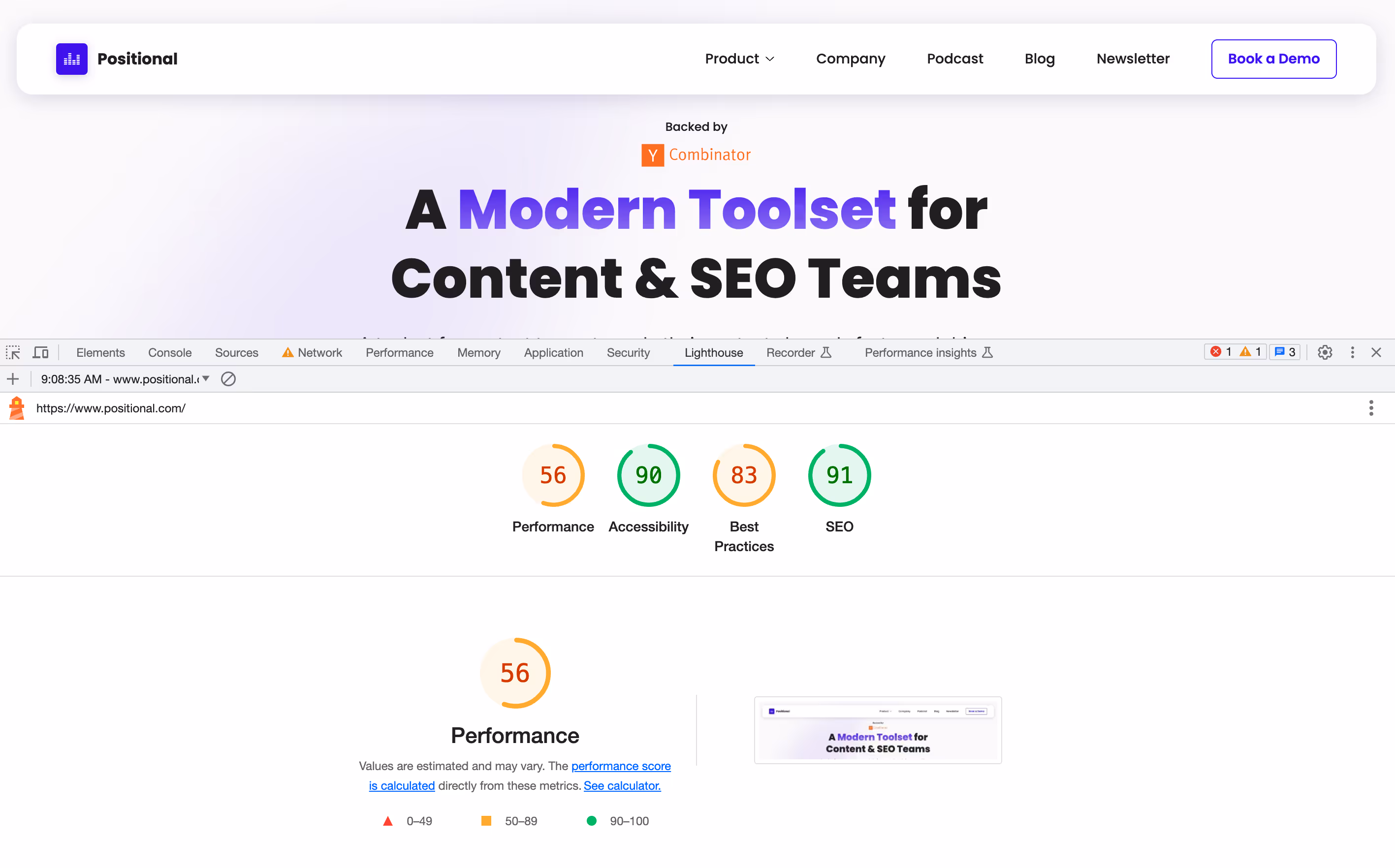
Google PageSpeed Insights is probably the most commonly used and includes Lighthouse, an open-source tool for analyzing and improving web page performance. It can be run against any web page to audit performance, accessibility, progressive web apps, SEO, and more.
If you’re launching a new website, it’s probably a good idea to run it through a couple of these tools to check for major issues. Similarly, anytime you release a big update or notice a drop in search rankings, run your site or the affected pages through these tools to ensure you don’t have any performance issues.
Browser Tools
Most modern web browsers, such as Chrome, Firefox, and Safari, offer built-in developer tools that include performance analysis capabilities. Access these tools by right-clicking on a web page and selecting "Inspect" or using keyboard shortcuts like F12 or Ctrl+Shift+I. Within the developer tools, you'll typically find a "Performance" tab that allows you to record and analyze the page's loading performance, including LCP.
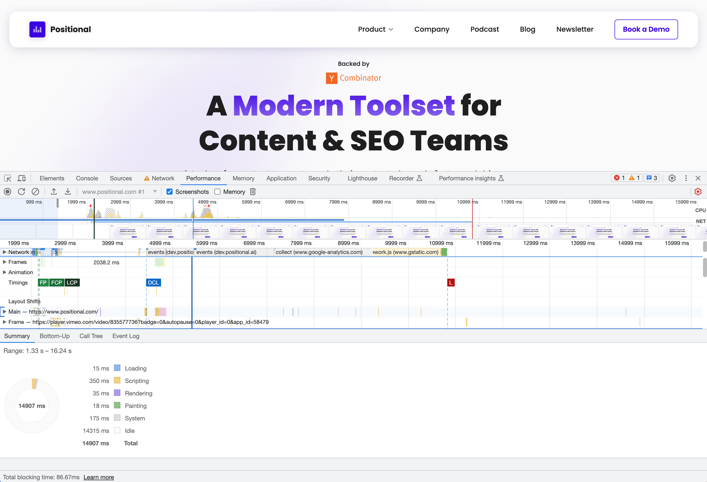
Chromium)-based browsers (like Chrome, Vivaldi, and Edge also have Lighthouse included, so you don’t even need a browser extension or external website to run these reports.
Browser-based reports are convenient for web developers testing new versions of your site before they go live. This can help your team catch any performance issues before search engines pick them up and penalize you for them.
Identifying and Fixing Specific CLS Issues
When you run Lighthouse or other browser reports on a website and notice CLS issues, a few things typically contribute to low scores. Let’s look at a few examples and some possible solutions.
Images and Media Without Dimensions:
Images, videos, animations, or canvas elements without specified dimensions can cause layout shifts when they load, as the browser does not know how much space to reserve for them on the screen.
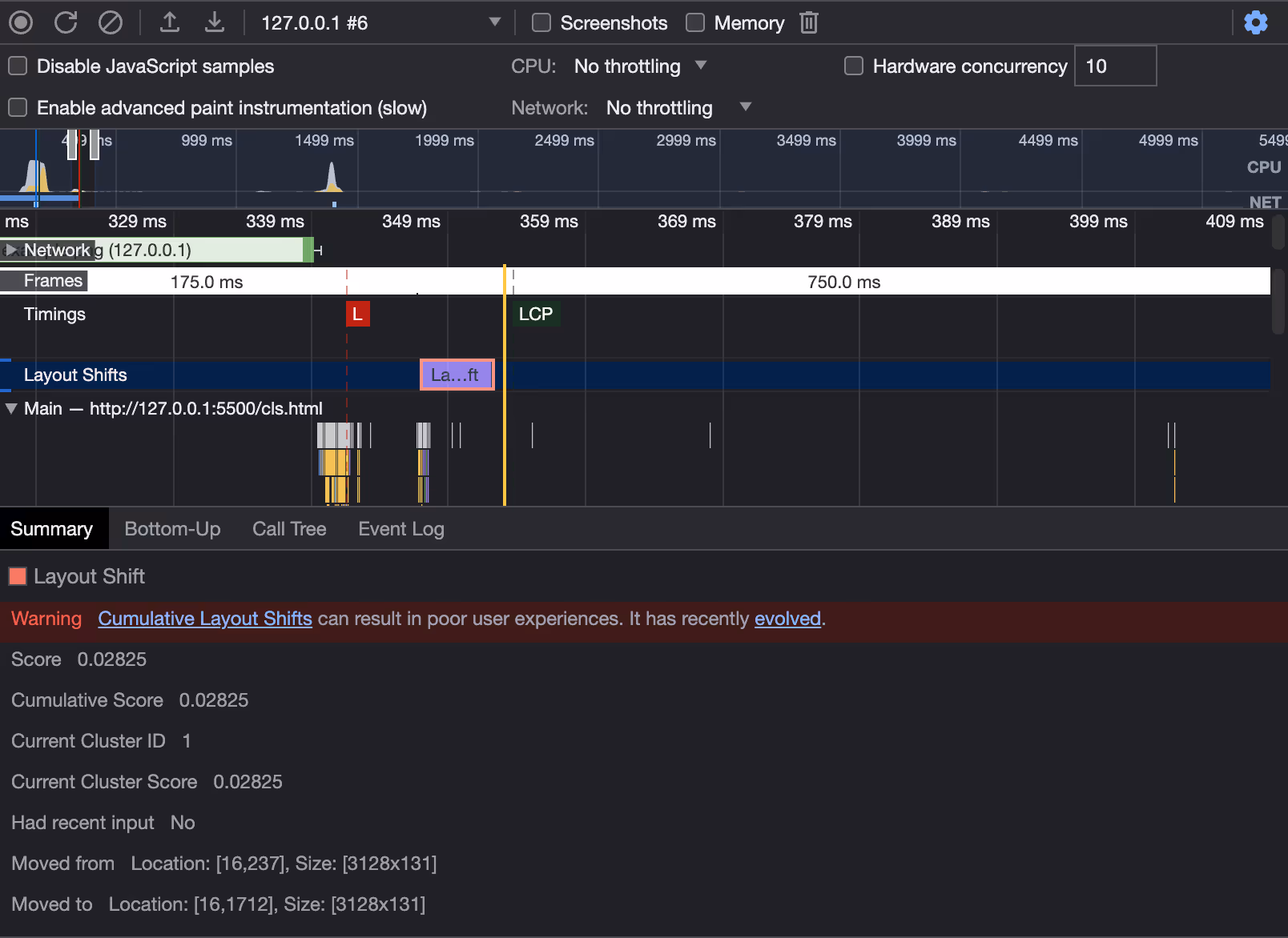
The screenshot above shows a layout shift caused by an image loaded by the website that doesn’t have any specified dimensions.
To solve this issue, inspect the elements causing layout shifts and update your HTML and/or CSS to explicitly define width and height attributes:
Now, the browser won’t render layout shifts because it will hold space for the image using the width and height you provided.
Fonts
Custom fonts (those not supported by browsers by default) may also lead to CLS if they load slowly or if there's a delay in rendering text with the correct font.
Fonts contribute to CLS via FOIT (Flash of Invisible Text) and FOUT (Flash of Unstyled Text). FOIT leaves text invisible until the font is downloaded, while FOUT replaces the system font with a web font after the latter is loaded, which could lead to a layout shift.
There are a few methods you can use to minimize the impact of CLS from fonts:
- Only Use Web Fonts When Necessary - Though this may not be the most attractive option, system fonts are instantly available and don't cause any layout shifts.
- Use fewer font files - Each font weight and style typically uses its own font file. This leads to multiple HTTP requests, slower loads, and more layout shifts. You can circumvent this by loading just one font file or by hosting fonts on the same server or CDN as your HTML.
- Use a woff2 font format - This format uses Brotli compression, which results in the smallest possible file size and is supported by all major browsers.
- Use the font-display property - Using the font-display property allows you to control how fonts display while loading.
When using the font-display property, the “swap” value can be useful. It displays a fallback font, then swaps it with the custom font after it’s loaded:
This method allows you to reduce CLS, ensuring a smoother user experience.
Dynamically Injected Content/JS Loaded Content
Dynamically injected HTML or other content loaded through JavaScript can cause layout shifts if not handled properly. The key is to ensure these elements have a predefined size or reserved space in the initial HTML.
For example, if you want to use Javascript to add dynamic content to a <div>, you can avoid layout shifts by styling the div with width and height attributes, much like you did with media above:
Now, the content inserted by JavaScript won’t force the layout to shift as the space for it was already allocated.
Improper Script Load Order
If your website needs certain CSS or JavaScript files to render the DOM, be sure these load quickly and at the beginning of your page. While typically, you want render-blocking JavaScript to load after your page loads, this can be a problem if the JavaScript causes layout shifts that you can’t fix by placing dimensions on specific elements.
As a general performance best practice, be sure all your files are loaded from a fast server (ideally a CDN) that is close in proximity to the end user. Beyond that, ensure that scripts are optimized and any that may cause layout shifts are loaded before the DOM is rendered.
Final Thoughts
Cumulative Layout Shift (CLS) is an important part of web performance, user experience, and search engine optimization. Because of this, it’s clear how valuable measuring and improving your CLS score is, so be sure you’re keeping it in mind with each major site update you make. Keep the following best practices in mind as you measure and work to improve your CLS:
- Reserve space for images and dynamic content by specifying sizes explicitly
- Optimize custom font loading or “swap” them with system fonts
- Check your script load order
By implementing these, you can significantly reduce Cumulative Layout Shifts on your website, leading to a smoother and more pleasant user experience and better search rankings to boot.
Finally, if you’re working to improve your SEO overall, CLS is just a piece of the puzzle. You can also leverage Positional's tools to enhance your website's SEO performance by flagging low-quality content, finding new keywords, and identifying internal linking opportunities. We’re releasing new tools often, so be sure to book a demo today.